Webdesign Block – 23 Examples and Resources
Following the advent of the grids in webdesign, layout based on blocks of content or blocks of images may be a good strategy for some web designs. That’s why we will show a brief overview of such sites and resources that will inspire you’re in order to create your site based on blocks.
Planning to launch website based on Webdesign block?
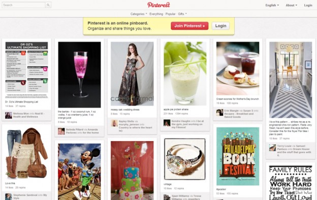
Layout based on modular blocks of content has become essential for portfolios, websites inspiration, in short they are often sites of a large batch of images. Made popular by sites like Pinterest for example, or inspired by applications like Flipboard or the Metro design on Windows Phone 8 devices, navigation is quick and easy, offering a lot of content which is scannable quickly.
The responsive web design also plays a crucial role: by definition a modular unit will adapt to the size of the user’s viewpoint. This type of layout is well suited to different mobile devices today.
Since this kind of web design is used extensively today, I offer a small selection of websites that are well made with this layout, and then invite you to test different tools and plug-ins to create your own website in modular blocks!
We understand that implementing a block-based design requires both creativity and technical expertise. While this approach offers numerous benefits, it’s crucial to balance aesthetics with functionality. We recommend considering factors such as load times, user experience, and content hierarchy when adopting this style. Additionally, it’s important to ensure that your block-based design remains accessible to all users, including those with disabilities.
By combining innovative design principles with thoughtful implementation, we can help you create a website that not only looks stunning but also performs exceptionally across all devices and platforms. Whether you’re refreshing an existing site or starting from scratch, our team is here to guide you through the process of crafting a modular, responsive, and engaging web presence that truly represents your brand.
Webdesign Block – 23 Examples and Resources Read More »